Bead
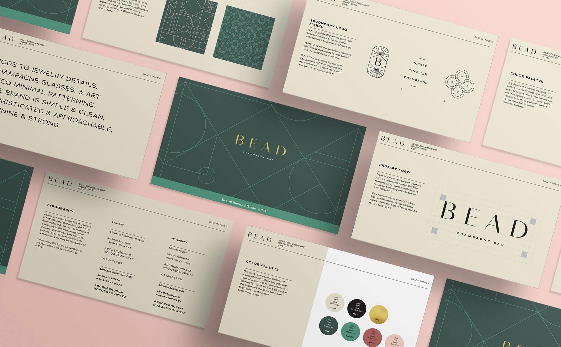
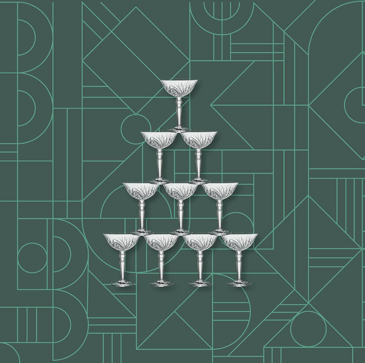
An identity crafted with nods to jewelry details, champagne glasses, and Art Deco minimal patterning in San Jose, CA.
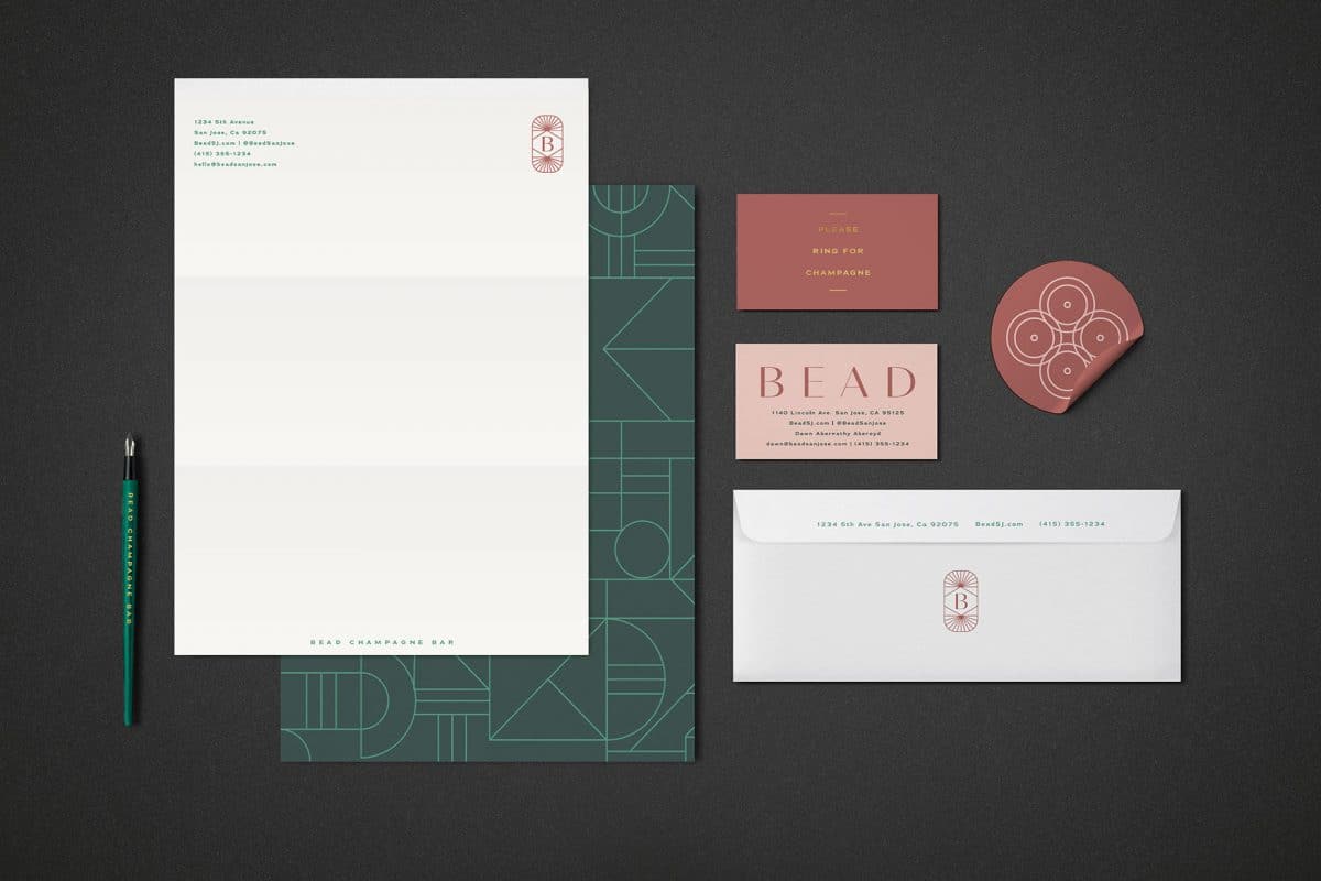
Done in a minimal san serif typeface with an undulating weight, the Bead logo features an Art Deco simplicity and luxurious breathing room between each letterform. The secondary logo mark features a geometric lockup that is an interpretation of champagne flutes from above; an aerial view of stem, rim, and bowl in concentric dance. As a whole, the brand is simple and clean, sophisticated and approachable, feminine and strong.
