Hazie’s
Hazie’s gives way to a world of the surreal 70s where you can walk in, grab a drink, and enjoy and let-loose with a friend or strangers alike.
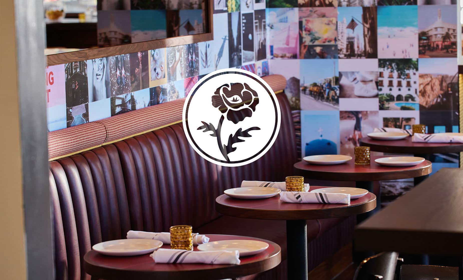
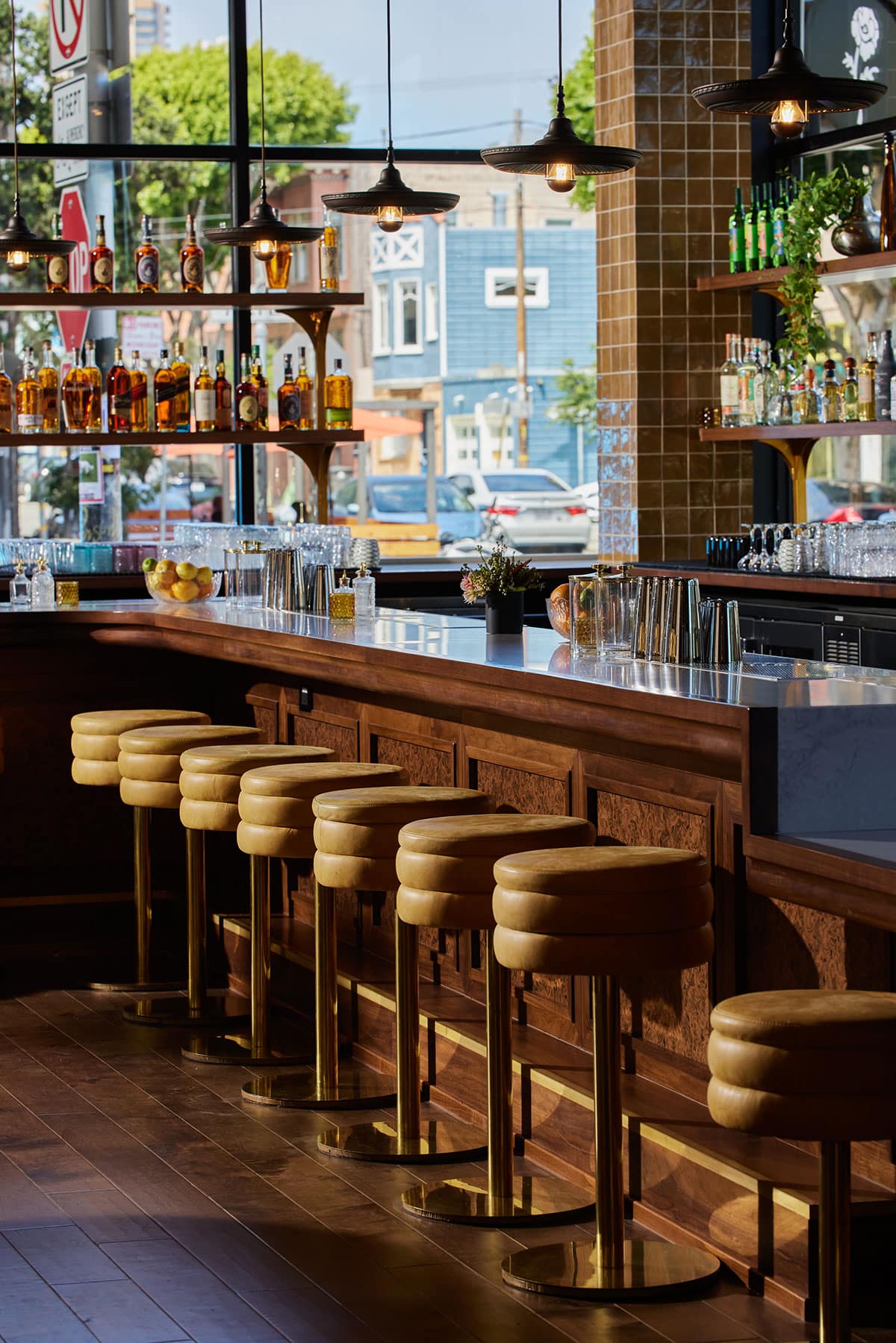
With an interior space worn in like your favorite pair of jeans and an eclectic rotation of rock and roll sounds, Hazie welcomes you to your new neighborhood spot. A friendly watering hole in the middle of Hayes Valley with the ethos of San Francisco in the decade of love. Come by old friend.
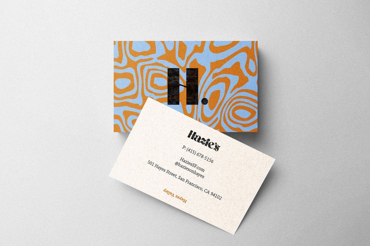
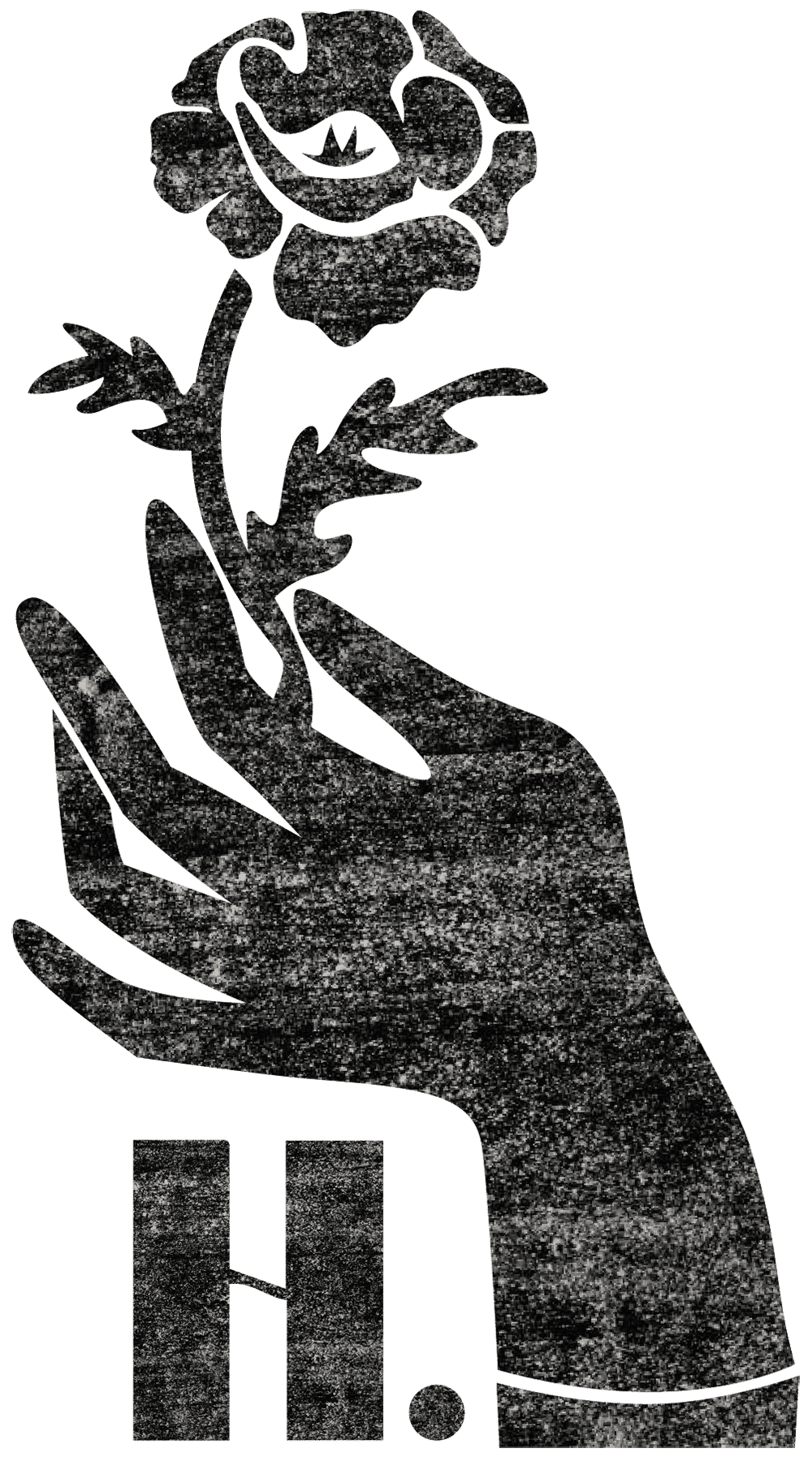
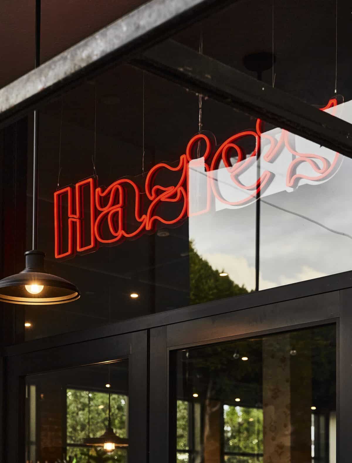
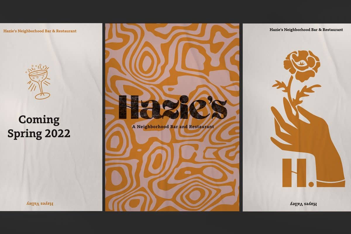
The Hazie’s logo features a typeface with wavy characteristics and high contrast between its thick lines and thin tapers. It pays homage to the style of the free-spirited 1970’s. A stylized hand delicately holds onto a poppy flower; an icon of California. An abbreviated “H” fits snugly in the curvature of the hand. The pattern is a graphic inspired by the burl wood texture of the bar facade within the restaurants’ interior, and acts as a contemporary update to a more traditional tie dye pattern. A red neon sign hangs in the entryway, greeting night time visitors with a warm bar-centric feel. At the corner of the building, a blackened steel blade sign glows with the Poppy flower icon logo, beckoning visitors to stop in.
