Jo’s Modern Thai
Exceptional Modern Thai food creates a unique offering for Oakland neighborhood spot with cool, laid back design vibes.

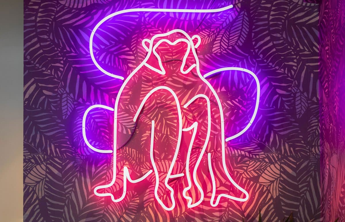
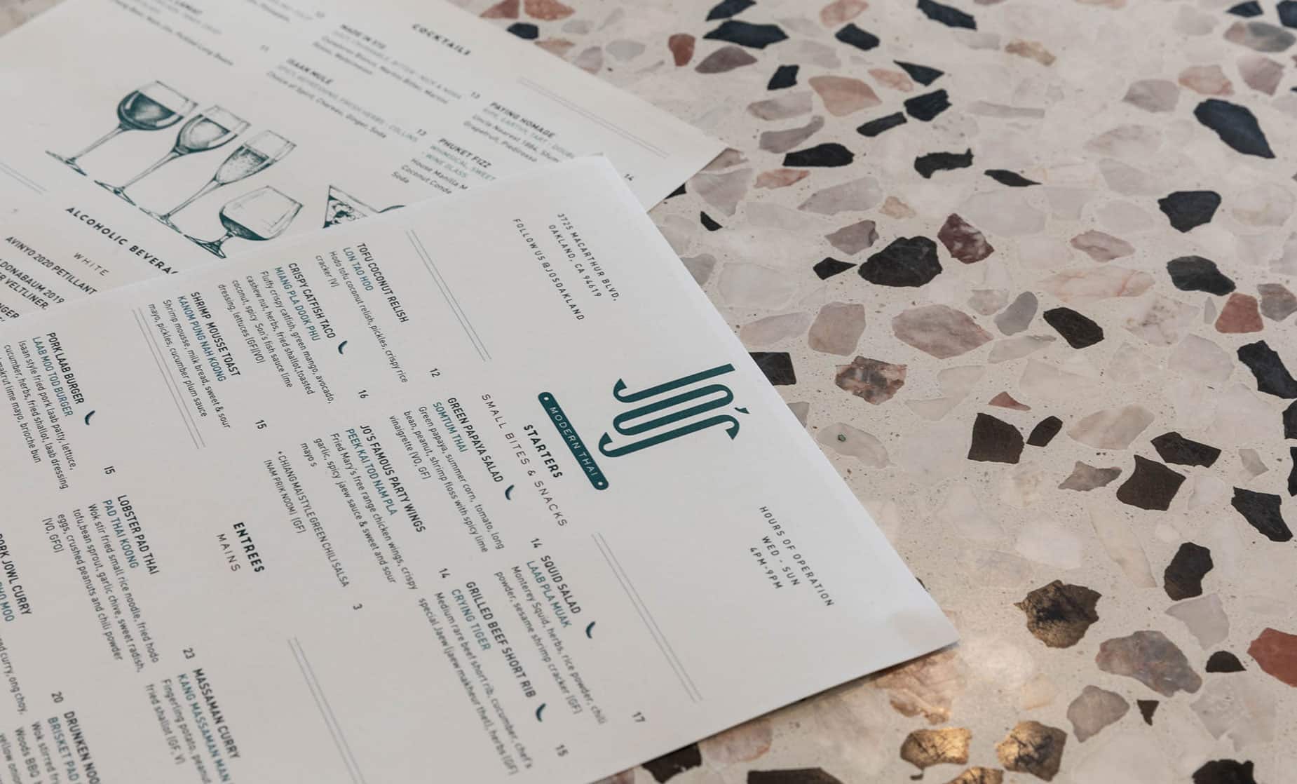
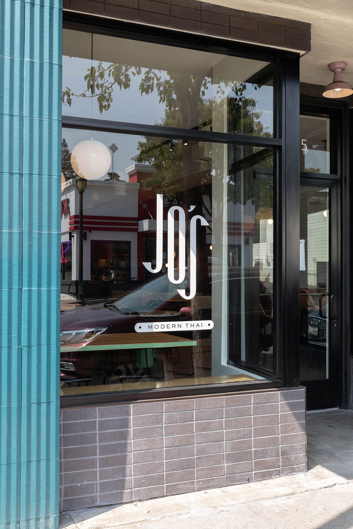
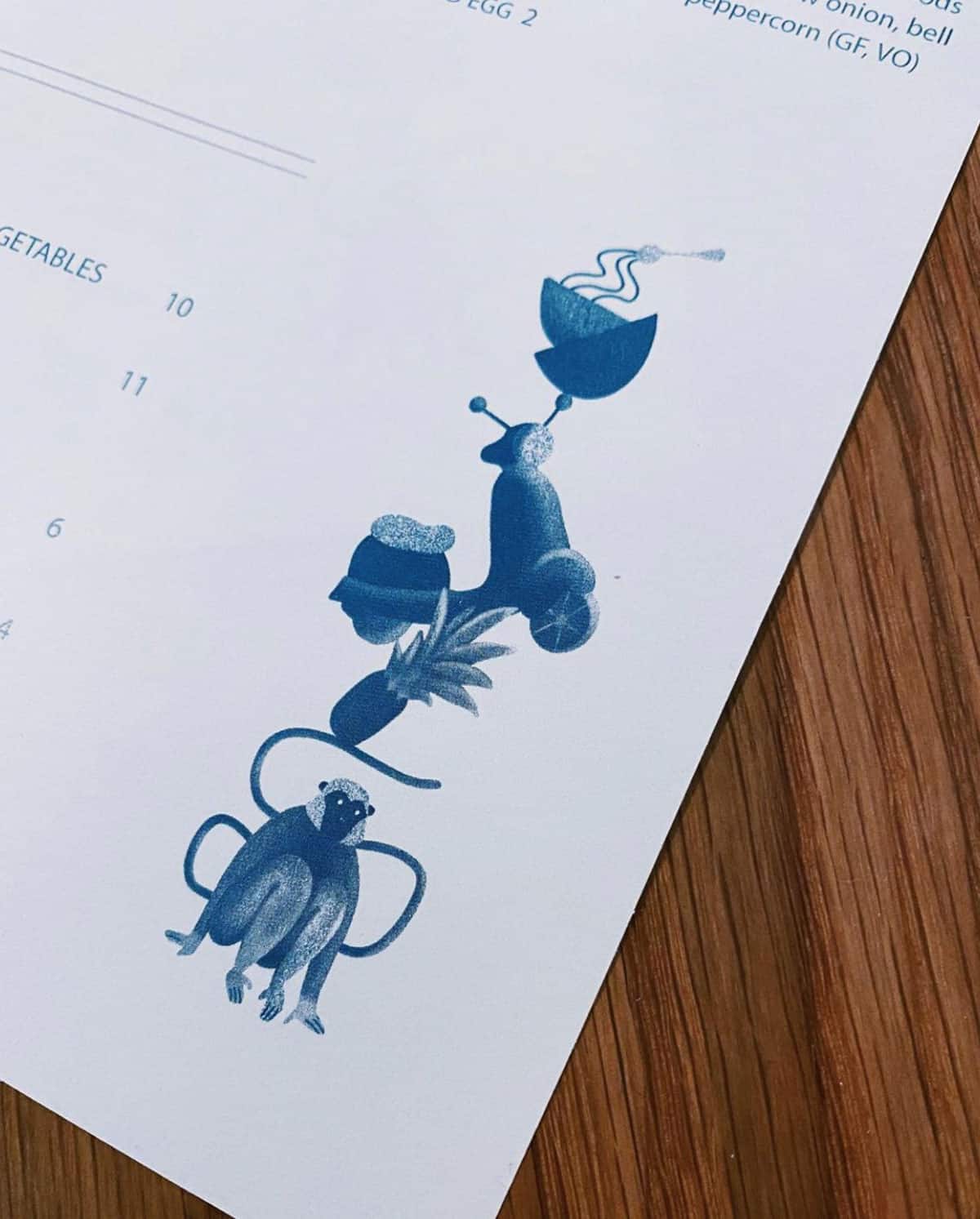
When Kao Selee approached us about creating a modern thai restaurant that connected his love of the Bay Area with his thai roots we were hooked. We worked with him on thinking through the name which we landed on Jo’s, after his girlfriend who had never had Thai food until she met Kao. She is now a frequent patron of course. The idea of it being a family name that was surprisingly simple, modern and elegant landed well for the concept and Kao’s vision. The shape of the letters intrigued our graphic senses and as a result we played heavily into an elongated, modernized typography that suited well to the space. The addition of the playful monkey and plate drawing added a sense of unpretentious charm that Kao was looking for. He wanted the design to be modern, approachable, rooted, and lighthearted and the color palette was pulled from his interpretation of what a Thai restaurant should feel like.


