XICA
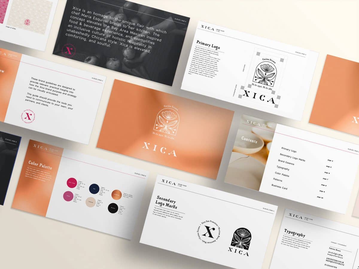
The Xica identity is a balance of elements: feminine and masculine, refined and simple, traditional and contemporary.

Xica is a tribute to the unique flair with which Chef Maria Esquivel brings to her kitchen. The concept elevates the Bay Area Mexican inspired food & beverage experience, and exemplifies an inclusive culture of holistic hospitality in unabashedly Chicana style. Xica is elevated, comforting, and soulful.
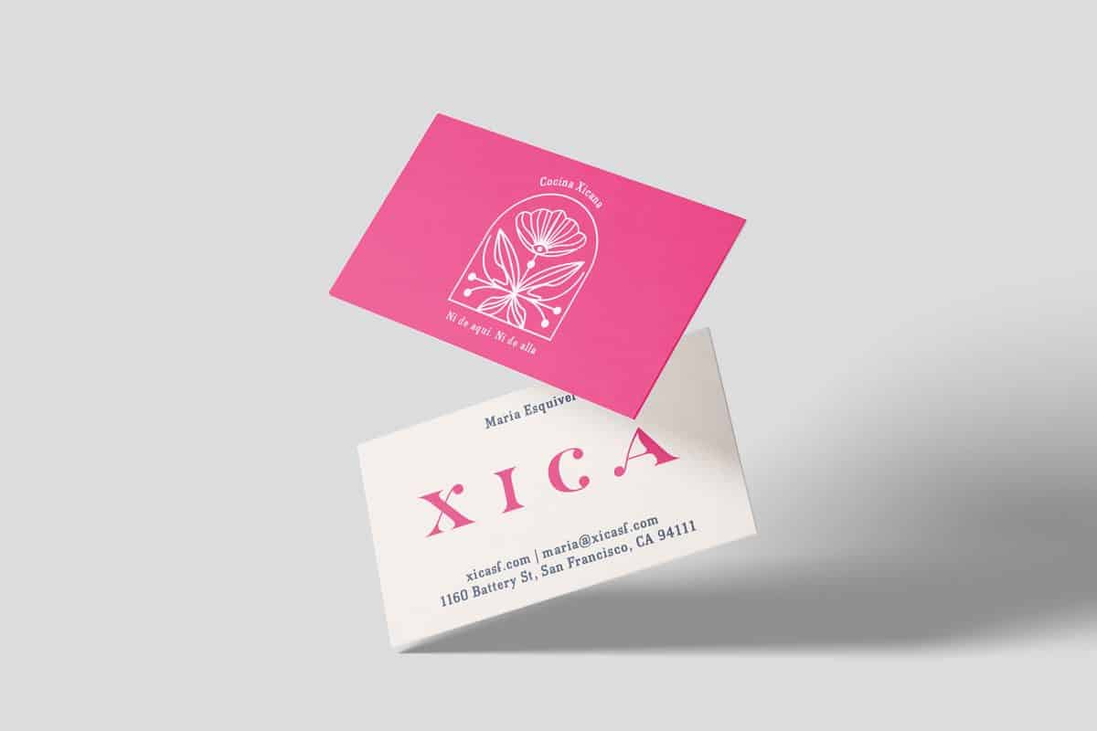
The logo mark features a floral stamp with leaves in the shape of an ‘X’. Also resembling a monarch butterfly, which holds significant meaning in Mexican culture. In the center of its petals is an evil eye to bring luck. Circular dots punctuate both the logo mark and typographic logo to establish consistency between them. The tagline “Cocina Xicana. Ni de aqui. Ni de alla.” roughly translates to “Mexican American Kitchen. Not from here, not from there.”


